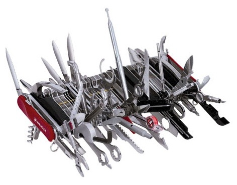
Marissa Mayer said that Google tries to think of its design like a Swiss army knife. It has tons of features neatly tucked away inside, but you don’t see them all at once. A first time user might come to the site and just the main knife is flipped open. It’s immediately clear what the main benefit and purpose of this thing is: it’s a knife. But for the advanced users, a little thumbnail catch is still visible so they can slowly start to pull out lesser used features when they’re needed.
Many people’s web-site are like a Swiss army knife with every damn tool in there pulled out and exposed. “What the hell is this site for?”, a first time visitor might wonder. And like that, you’ve lost them. They’ll check the next result on Google.
Think of an effective design like a Swiss army knife. It has tons of features neatly tucked away inside, but you don’t see them all at once.
Keep the site simple with a clear path and purpose. Extra stuff on the page actually does have a detrimental effect in terms of confusion and distraction. Be adamant about eliminating unnecessary pieces of a design.
Extracted From: Smashing Magazine


No comments:
Post a Comment